Web forms provide Radio group element that enables selection of only one option. Radio group element is similar to the checkbox group element, only difference is that checkbox group allows you to select multiple options. Below are the settings you see after adding Radio group element to the web form.
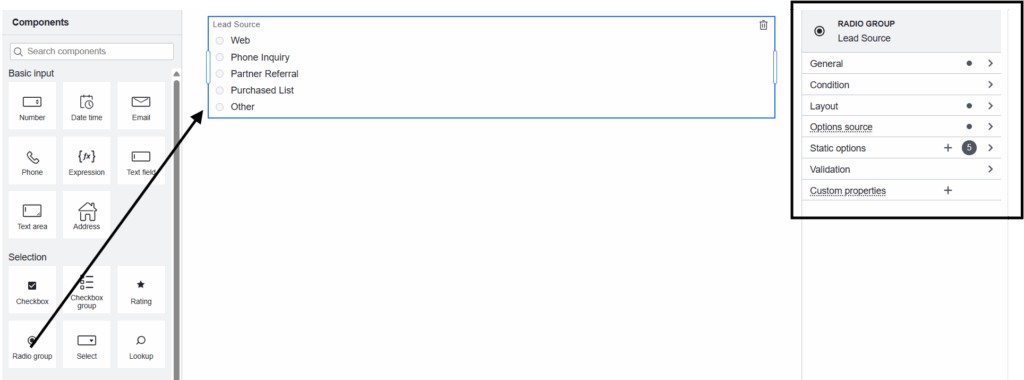
General
- Field label : Label of the Radio group form element you wish to capture through web form.
- Field Description : A description of the Radio group form element, typically providing details on the kind of data it captures.
- Data Sources : Create Data Sources to extract data from Salesforce. These Data Source will appear here. Let’s say if you want to display Contact(with all the information like First Name, Last Name, Source and so on). You need to fetch that data by creating SOQL Data Source on Contact object and supply the data to the form using this Data Source.
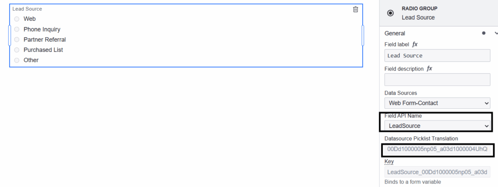
- Field API Name : Select the Data Source field(Source field in the above example) to map your Radio group form element here.
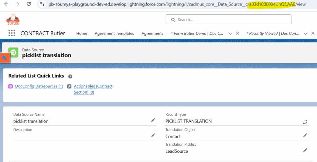
- Datasource Picklist Translation : You can find more information on how to create picklist translation Data Source here. Create Data Source for the muti select picklist field you wanted to map the Radio group form element. Once you map that field to the Radio group form element, then the system will automatically map Datasource Picklist Translation to the created Data Source.


- Key : Each form element you add to your web form has a unique, automatically generated value. That is visible here.
- Transient : If enabled, the field will not be saved in Salesforce after the Web Form is submitted.
- Default value : You can specify a default value for the Radio group element here.
- Disabled : If enabled, then you cannot edit the field, and data will not be submitted. Takes precedence over read only.
- Read Only : If enabled, then you cannot be edit the field, and data will still be submitted.
Condition
- Hide if : If you need to hide your Radio group form element under certain conditions, then you can mention such conditions in Hide if editor of Radio group form element.
Layout
- Columns : By default, this is Auto, meaning that you divide the form based on the number of form elements you add in a single row. You can change it according to your business needs, so that you divide the form into the number of columns mentioned here.
- Options Direction : You can choose to align options horizontally or vertically.
Option Source
- Static defines a constant, predefined set of form options.
Static Options: You can create Static options here, where you can give the Label and Value for the options accordingly. - Input data defines options that are populated dynamically, adjusting based on variable data for flexible responses to different conditions or inputs.
Dynamic Options: Define which input property to populate the values from.
Input Values Key: The input property may be an array of simple values or alternatively follow this schema:[ { "label": "dollar", "value": "$" } ] - Expression defines options that are populated from a FEEL expression.
Options Expression: Define an expression to populate the options from.
The expression may be an array of simple values or alternatively follow this schema:[ { "label": "dollar", "value": "$" } ]
Validation
- Required : If your Radio group input is mandatory for your form to save, then enable this.


